
Transport for NSW
Opal digital card app
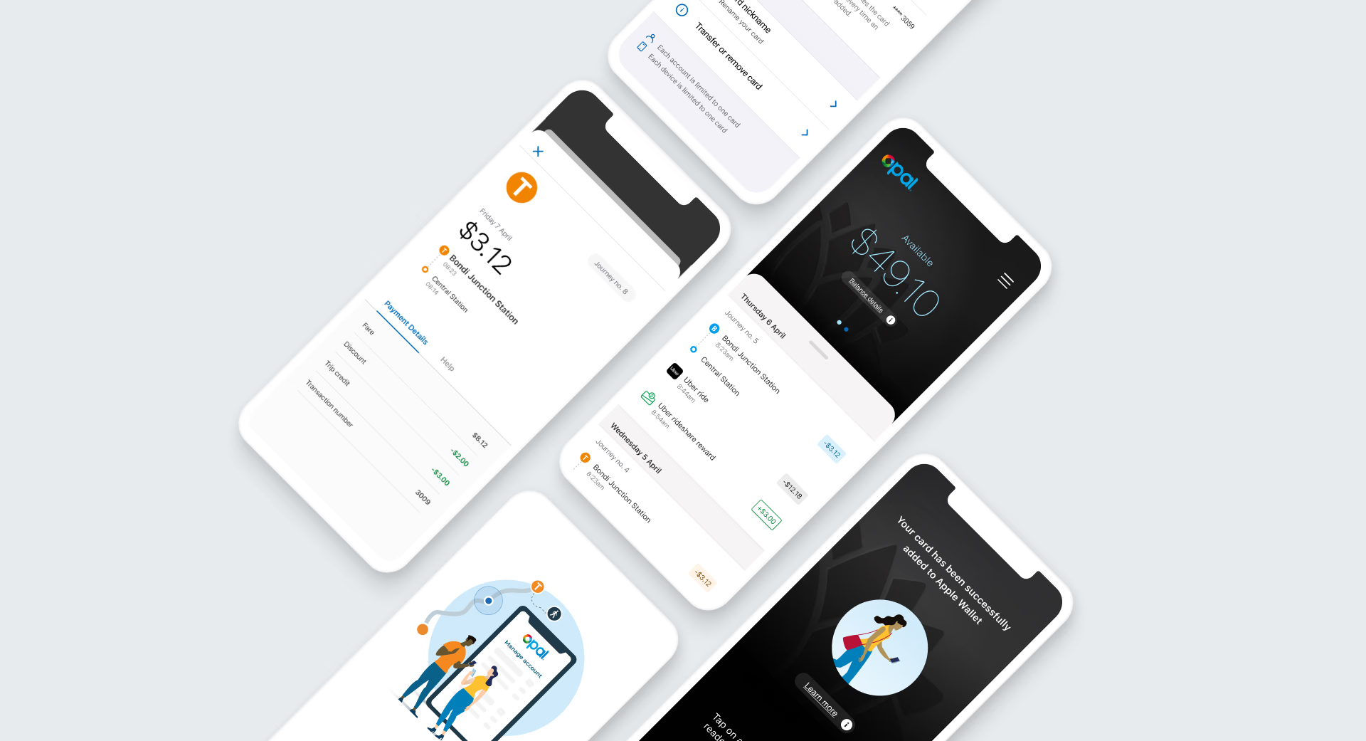
Creating a new digital experience for Opal cards - enabling customers to tap on and tap off with an Opal card loaded into the digital wallet of their smartphone or watch.
Overview
Designing the UX/UI experience
I was responsible for the end-to-end UX/UI journey, working alongside the front-end dev team and BAs, supporting the project from idea generation through to delivery. This involved designing the user flows, interactions, animations, prototyping and stakeholder presentations. I undertook regular usability testing to identify improvement opportunities from customer feedback.
The design process
-
Wireframes
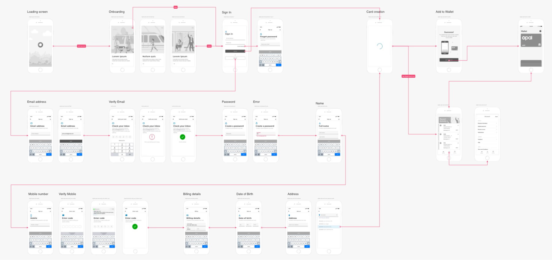
I visualised each screen from onboarding to sign up and card provisioning.
-
User flows
I broke down scenarios from new to existing users for both iOS and Android.
-
Prototyping
I developed an interactive prototype to demonstrate the screen interactions.
-
User testing
I completed a heuristic evaluation of the prototype to gain insights and pain points.
-
Iterative design
The results from each round of testing helped to refine and improve the designs.
-
High fidelity UI
I output and uploaded the final UI to InVision as part of dev handover.
User flows
Building the user flows
I gathered requirements for the user flows through several sessions with the product owner and business analysts. New users needed to register their contact and payment details before they could enable the Opal card in their digital wallet. I started pulling user interface inspiration from popular apps to study how they guide users through complicated onboarding journeys.
The onboarding requirements introduced a challenge due to a lengthy sign-up process. I designed the flow with these challenges in mind, progressively leading users through each task in the sign-up process to help minimise their time on task and the overall cognitive load required.
Design delivery
Screen design constraints
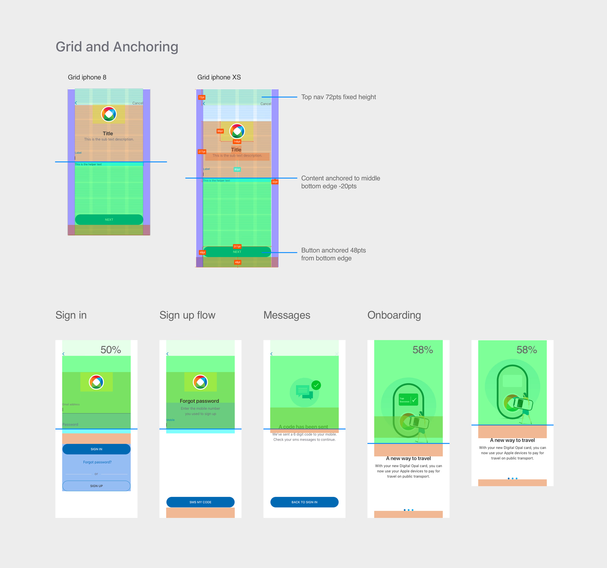
As I was designing apps for devices that varied across platforms, models and versions, I needed a systematic way to communicate to developers how my designs would adapt to different screen size variations. I discussed the interface constraints with the dev team, then spent time exploring Apple's Xcode to understand its auto layout functionality. From there, I developed a system using grids and anchoring constraints across the screen templates, and we scaled it across both iOS and Android platforms.
User testing
Remote user testing
To guide our testing sessions, we set out to:
- Identify how easy or hard participants felt the onboarding process was
- Understand where we rank in terms of customer perception of security
- See how users perceive extended wait times during sign-up
- Uncover any pain points and general usability issues
- Discover the best time to ask users to enable notification permissions
Together with myself as facilitator and an observer, we ran 1:1 remote moderated sessions via Teams using an online prototype. Key findings:
- Overall, customers found the sign-up process easy to use
- Wait time was long, but tolerance levels were acceptable - thanks to the animation and knowing a process was happening in the background (spinning logo)
- Tech-savvy participants who were existing Opal customers expected to be able to sign up with one click
- Most participants wanted clarification, prior to sign-up, that auto top-up is a requirement
- Most participants opted to "Allow" (iOS) push notifications when prompted
- Similar experience to registering with a banking app, and felt secure
- 4.2kUnique travellers
- 360kTrips - 7 / month / traveller
- 1.2MTop-ups
- $1.1MFares collected
- 70%Used Opal cards prior to the trial
- 80%Would use again
Push notifications
Permission prompts for iOS
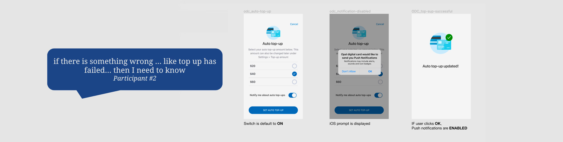
On iOS, users have to grant permission to enable push notifications - and we only get to ask once. If a user taps "Don't allow", we can't ask again unless they request it; after that, they'd need to enable it manually in Settings, a suboptimal, multi-step experience. Android users are opted in automatically, so this wasn't a concern there.
In the prototype, we included a toggle switch to test the hypothesis that most users would opt in - a kind of pre-permission check. Leaving it on assumes they'll tap "Allow" when prompted; turning it off assumes they want it disabled, so we introduce some friction with an "Are you sure?" prompt, giving them a chance to reconsider.
Feedback
What customers told us
The trial ended, but customer sentiment stayed loud.
-
Why are we cancelling!!!??? I LOVE the digital card. The app was designed in a stunning way, it's all great!
-
I just want to say that the trial for the Digital Opal card was amazing from a CX perspective. Please bring it back. Yesterday!!