Westpac Group
Reimagine the Westpac mobile app experience
Developing new visuals and interactions for the Westpac mobile app experience.
The challenge
Create a shared and unified design language for the new Westpac app
Establish brand foundations and a scalable pattern library for native mobile, ensuring cohesive, accessible experiences across platforms, with clear governance to evolve with customer and business needs.
Project scope
Leverage the Westpac GEL and build upon brand foundations
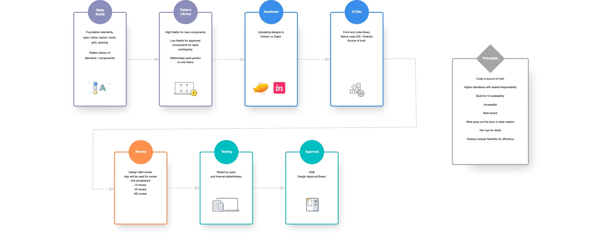
The designs were made using Sketch for the pattern library and mockups, then built into a living pattern library for the iOS and Android mobile platforms. InVision was used for communication, feedback, prototypes and developer hand-off.
-
Wireframes
Prioritised and brought clarity to the steps in the flow.
-
High-fidelity mockups
Injected detail into the wireframes with design system components.
-
Interactive prototypes
Usability testing, iterations and developer handoff.




Drag and drop
Transfer interaction guide
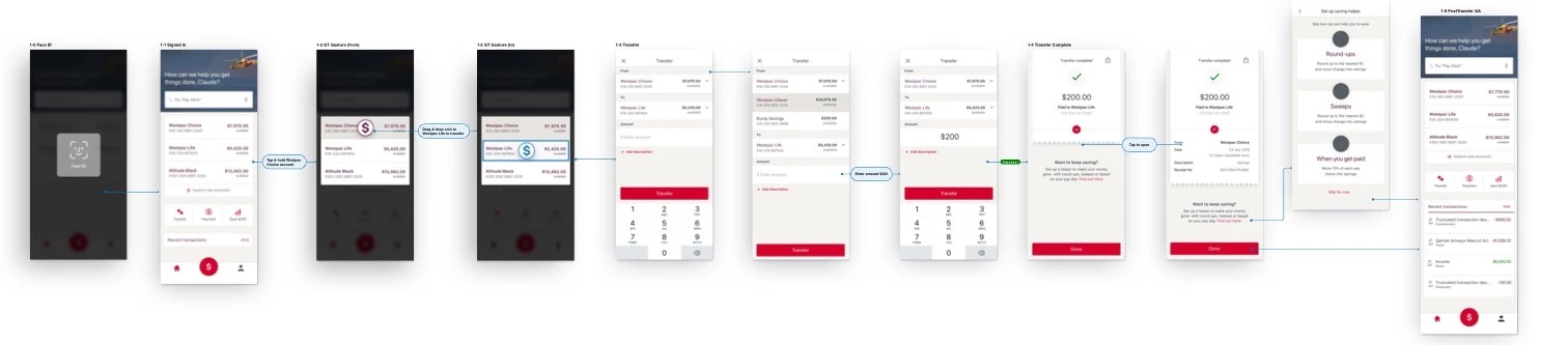
The drag and drop interaction initiates a transfer, pre-populating the TO and FROM accounts. The feedback loop engages users with the following animations:
- Screen background blur with a light tint (#D7D2CB)
- Tiles expand (2%) and contract on press/release, with a drop shadow (1, 11, 13, 40)
- Tile fill colour (#F4F3F0) changes on press/release
- Tile border colour and the coin fill colour both change from hero to primary when hovering over the TO account tile
- After drop, the coin shrinks and fades out, and the transfer screen slides up (250ms)
I created the animation below using Flinto to give the developers an understanding of how the micro-interactions would work.